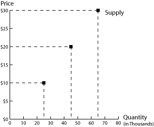
The same information that is presented using words or a table can also be shown on a graph. In economics, we typically use a two-dimensional graph that has the price of the good or service on one axis and the quantity that people are willing and able to sell on the other axis. This way of presenting the information corresponds to the tables above. For example, the information presented in the first table can be shown on a graph as:
Each point on the graph represents a point on the table. The top point shows that when the price of a bottle of red wine is $30, producers are willing and able to sell 65,000 cases of wine. Using the terminology presented above, the "quantity supplied" of wine is 65,000 when the price of a bottle of wine is $30. The middle point shows that the quantity supplied of wine is 45,000 when the price of a bottle is $20; the bottom point shows that the quantity supplied of wine is 25,000 cases when the price of a bottle of wine is $10.
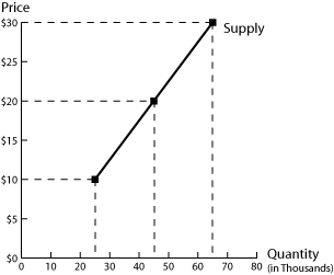
Instead of just plotting points on a graph, we usually draw a line through these points to create a more general picture of the supply for the product. We have done this in the next figure:
Notice that we have the same points as before. But by drawing a line, we showing what we expect producers to be willing/able to sell at other prices. For example, if the quantity supplied is 25,000 at a price of $10 and 45,000 at a price of $20, we might expect producers to be willing and able to sell 95,000 (half-way between 45,000 and 25,000) when the price of a bottle is $15 (half-way between $10 and $20).
We call this line the "supply curve" (in part because it does not have to be shown as a straight line). The supply curve has a positive slope: this reflects the law of supply. As the price of a product falls, the quantity supplied will increase.
We can also use this supply curve to see the effect of a change in the price of the product: as the price of a bottle of wine falls, we move from the top point on the graph to the middle point on the graph, to the bottom point on the graph. The only effect of a change in the price of the product is to move from one point on the supply curve to another point on the supply curve. So a "change in quantity supplied" is shown on the graph as a movement from one point on a supply curve to another point on the same supply curve.
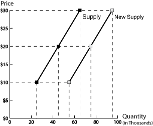
But what if something else changes? For example, how would we graph the change in technology described in the second table above (caused by the release of larger wine fermentation vats)? We can show this by graphing the three points in the second column of the table.
Notice that all three points (and the line that joins them) lie to the right of the original line. For example, look at the case where the price of a bottle of wine is $30; the first supply curve (on the left) shows us that before the machines were released producers were willing/able to sell 25,000 cases of wine; the second supply curve (on the right) shows us that after the machines were released , producers were willing/able to sell 55,000 cases of wine. At each point on the second supply curve, producers are willing/able to sell more wine. This reflects an increase in supply. So a "change in supply" is shown by a shift in the entire supply curve - it requires us to draw an entirely new supply curve.
Next: Using an Equation
Back to Supply